I always liked math, but I didn’t start to love it until I moved from Mexico to the U.S. at the age of 9. I had been so used to excelling in every subject in Mexico that submerging in a new school with a new language that I was just beginning to understand left me feeling defeated. I clung to the safety of multiplication tables and long division like I would to a flashlight in the dark. Eventually I learned English, and everything went back to normal, but I continued loving math to the point of pursuing a bachelor’s degree in it. Somewhere along the way though, it dawned on me that math was its own language, and while universal, not easily understood by everyone.
Unlike most people, I have the ability to interpret a story from a mathematical equation. Not until very recently did I hear someone validate this recognition of the beauty in numbers; Edward Tufte explained at a seminar in Oakland, “the commonality between science and art is in trying to see profoundly – to develop strategies of seeing and showing.” My art is a strategy for showing what I see, each bristle delivering a vital piece of information onto the canvas.
I’ll explain the mathematical components of a painting with my own pieces as examples. The mapping from 4D space onto a 2D canvas requires vector calculus to accurately display angle and dimensionality of the space. The thickness of the stroke conveys definition while the curve creates motion. Summed up together, the strokes show the image. The gradient of the color, the third variable, simulates heat, or light reflection. Multiplication of the colors allows greater illumination. While I don’t actively think in terms of calculus when I paint, I do intuitively employ mathematics to interpret between what I see and what I intend to show. All the variables and constraints work together to make up a mathematical model of the physical and emotional aspects of a moment. But art is beautiful because it is a flawed interpretation of the actual space. That flaw is the human factor that allows the spectator to not only see through the eyes of the artist, but to feel through her heart.
Zebra in Dusk, 2007 — There is a lot of mathematical complexity in this piece. To give the proper dimension to the image, the zebra stripes had to be just right. The width of the stripes has to decrease proportionately to the depth, yet still be randomized as they are in real zebras. The color gradient helps move the light across the curvature of the body.
Cherry-Picking, 2009 — This painting utilizes dots instead of stripes to deliver information on the image. The concentration of dots is a low-pixelated model of the number of petals in the cherry blossom tree. The background, intentionally out of focus, is a very flawed model of the chaos of a city surrounding the beauty of nature.
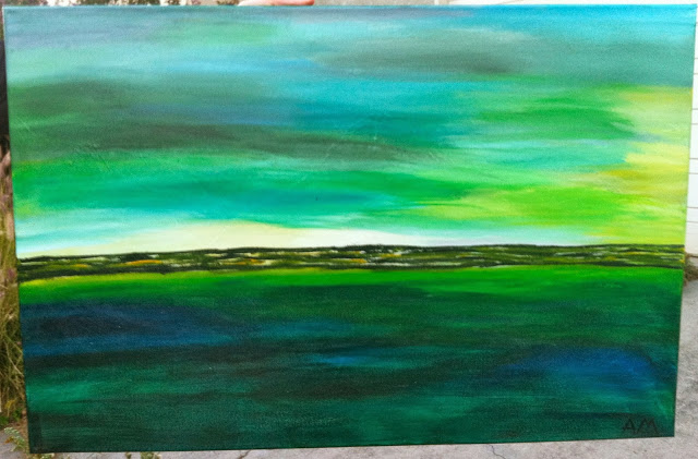
Island, 2013 –This painting is the crudest model of a landscape, but the sharpness of the horizontal landscape against the smoothness of the sky and water work together to present a rough idea of the space. I find abstract painting the most challenging because it requires the crudest of models, like trying to reach a port with no paddle, all you can do is hope to drift in the right direction.

